Bivariate Proportional Symbol Maps, Part 1: An Introduction

By Jonathan Schroeder, IPUMS Research Scientist, NHGIS Project Manager

A powerful, underused mapping technique

The world could use a lot more bivariate proportional symbol maps. These maps pair two basic visual variables—size and (usually) color—to symbolize two characteristics of mapped features. When designed well, they convey multiple key dimensions of a population all at once: size and composition as well as spatial distribution and density.

A map of the share of population under age 18 in the Miami area in 2020. There is one colored circle for each census tract. There are five colors ranging from dark blue (representing less than 15% under age 18) to light green (representing 20 to 25% under age 18) to brown (representing 30% or more). The circle sizes correspond to tract populations. Most circles have similar sizes, representing around 1,000 to 10,000 people. The circles cluster together forming groups where there are more tracts and more people. The circles in central Miami and along the coast are bluer than elsewhere.
A bivariate proportional symbol map.
Click map for larger version.

Unfortunately, standard mapping software hasn’t made it easy to create good versions of these maps, and most introductions to statistical mapping stick to simpler strategies. As a result, bivariate proportional symbols aren’t used very often. With few examples and little guidance to go on, it’s understandable that mapmakers don’t realize how often they’re a viable, well-suited option.

This two-part blog series aims to spark more interest by providing a “few examples” (Part 1) and a “little guidance” (Part 2).

Picking up where I left off

In a previous blog post, I shared an example of a bivariate proportional symbol map and described some of the technique’s advantages. But that post focuses on a mapping resource (census centers of population) rather than on mapping techniques. Most of the examples in the post are also simply “proportional symbol maps,” without the more intriguing “bivariate” part.

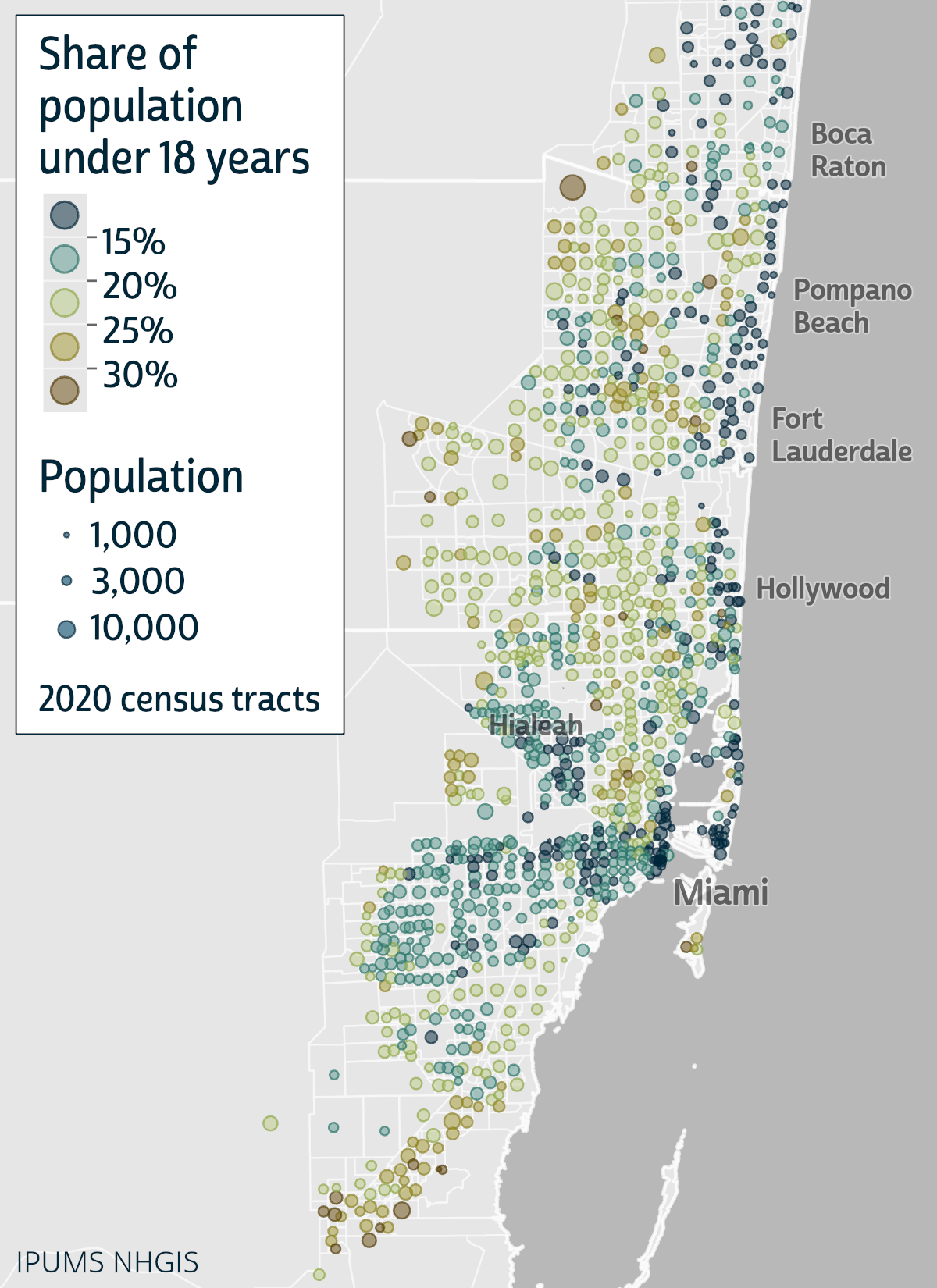
To close that post, I suggested “a tantalizing next step” would be to use bivariate proportional symbols with small-area data (for census tracts or block groups), and I shared a few technical notes and design tips without much detail. I later expanded on those ideas in a conference talk, sharing some new examples with small-area data and going a little deeper with design tips.

In these new posts, I’m sharing and building on the examples and tips from the conference talk.

Continue reading…

Making Your Customized IPUMS MICS Data File

By Anna Bolgrien

The newest IPUMS data collection, IPUMS MICS, has many similarities with other IPUMS microdata collections. However, there is one major difference: the IPUMS MICS Data Extract System only uses Stata.

Yes, you read that right. Users of IPUMS MICS must use Stata to open and create their customized data file.

Let’s start with how using IPUMS MICS is the same as using other IPUMS microdata collections.

If you are an IPUMS user, you will find the process of browsing the variables, looking at documentation, and adding samples to your data cart completely familiar. If you are not familiar with IPUMS, you can read more about browsing and selecting variables.

However, when you finish choosing variables and samples in IPUMS MICS and click “Create Extract,” things start to look different.

Normally, you could change the data format, but the only option currently available for IPUMS MICS is a .dat (fixed-width text) file format.

Continue reading…

Geospatial Contextuals from IPUMS International

By Ryan Gavin & Quinn Heimann

IPUMS International launched a new platform that will aid researchers using geospatial contextual data along with IPUMS International census microdata!

What is geospatial contextual data?

Geospatial contextual data describe features of the physical and social environment of a geographic area, and allow users to explore how contextual factors interrelate with individual characteristics and outcomes. For example, in their 2020 paper in Global Environmental Change, Mueller et al. estimated the effects that climate-related variables had on migration in Botswana, Kenya, and Zambia between 1989 and 2011. Often, however, these data are large, complex, and packaged in unfamiliar ways. With this new platform, IPUMS International simplifies the process of identifying and linking contextual data with our robust repository of census microdata.

Geospatial contextual data can vary across space, time, or both and often do not obey administrative boundaries. IPUMS International is unique in offering spatiotemporally harmonized administrative geography variables, which when linked to time-variant contextual data, allow researchers to explore the relationship between social phenomena and temporally-dynamic geospatial data using a consistent spatial footprint.

For example, researchers might be interested in studying how changing January precipitation in Bangladesh from 1991-2011 is associated with social or demographic variables. In this case, harmonized geographic variables are ideal because of administrative boundary changes in Bangladesh between 2001 and 2011.

Maps of Bangladesh in 1991, 2001, and 2011 showing the total January Precipitation using year-specific geography and harmonized geography.
Bangladesh map showing January precipitation totals for each census year, showing the difference between year-specific and harmonized geography for measuring effects.

Continue reading…