By Jonathan Schroeder, IPUMS Research Scientist, NHGIS Project Manager
How to make effective bivariate proportional symbol maps
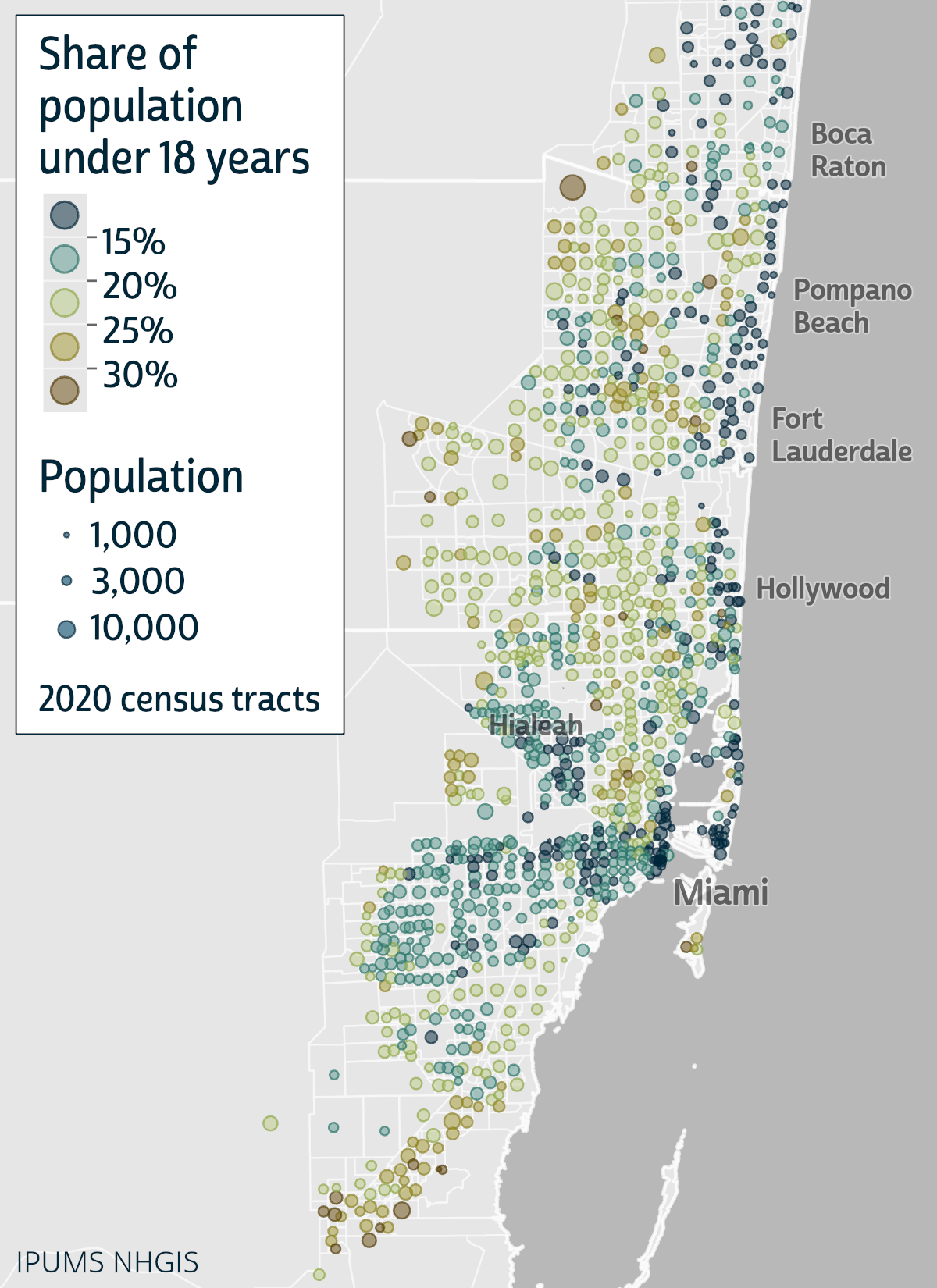
Click map for larger version.
In Part 1 of this blog series, I introduced bivariate proportional symbol maps and shared some examples to demonstrate their advantages. In short, when they’re well designed, they can make it easy to see multiple dimensions of a population all at once: size, composition, and spatial distribution.
A key part of that statement is, “when they’re well designed.” Standard mapping tools can make it easy to get started, but getting all the way to a good design still takes some extra effort.
In this Part 2 post, I discuss some key design considerations for bivariate proportional symbol maps, and I provide specific instructions to help you get to a good design.
Software considerations
I used Esri’s ArcGIS Pro to create the examples here and in Part 1. The design tips I share below should be relevant for any mapping tool, but my instructions are specifically for ArcGIS Pro (version 3.2). I expect there are ways to achieve similar designs with QGIS, R, Python, etc., quite possibly more easily than with ArcGIS Pro. I can only say that it’s easier to create effective bivariate proportional symbols now with ArcGIS Pro than it was with its predecessor ArcMap.
As I proceed, I’ll flag which instructions pertain specifically to ArcGIS Pro. All other tips are “tool neutral.”
General tip: Match size to “size” and color to “character”
When selecting which features to map, a framework that works consistently well is to use symbol color to represent an intensive property—e.g., the share of population under 18 years old, average household size, median household income, or the share of votes cast for a candidate—and use symbol size to represent the number of cases to which the intensive property pertains—e.g., the total population (when color corresponds to a population share) or the count of households (when color corresponds to average household size or median household income).
This framework enables the map to illustrate both the spatial distribution of the mapped characteristics and the frequency distribution of the intensive property—e.g., not only where a candidate received large or small vote shares but also how many votes were cast in each of those areas. Other frameworks can also work well (e.g., see the change maps in Part 1), but it’s generally very helpful if the two mapped characteristics relate to each other in a way that corresponds intuitively with “size” and “color.”