By Lara Cleveland
IPUMS International regularly asks representatives of National Statistical Offices (NSOs) around the world to share their data with the research community. While IPUMS offers a license payment to countries for the right to redistribute microdata, NSO representatives are most interested in how sharing data with IPUMS will benefit the people of their countries. After 30 years of harmonizing data that NSOs have shared with us, IPUMS can indeed point to innovative research from data users all over the world, many at major universities in these partner countries. Directors of statistical offices, especially those with close ties to academia, are thrilled that the data are used for scholarly scientific production and for the purpose of educating the next generation. However, most of these leaders are much more interested in how data sharing leads to effective policy. And they want examples. They are essentially asking how the data have been “used for good,” as the original IPUMS tagline, “Use it for good!” implores.
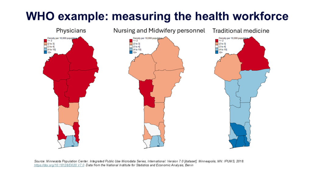
In response, IPUMS has been following data-to-policy trails where we can find them. The United Nations’ efforts to establish and measure the Sustainable Development Goals (SDGs) have provided wins in this area. Early in the life of the SDGs, colleagues from the World Health Organization visited IPUMS to leverage detailed information in the occupational variables for locating the health workforce. Microdata from censuses helped them measure the density of a range of health worker classifications at subnational levels. The International Organization for Migration (IOM) did similar work to disaggregate census-based SDGs by migratory status. At the start of the pandemic, The United Nations Population Fund (UNFPA) used IPUMS census microdata to spin up a dashboard showing the living arrangements of older adults, again at subnational levels. Each of these applications of IPUMS International data resulted in policy recommendations, informed by additional data, additional policy research, and pilot projects.
These UN organizations, of course, are in the business of using data to inform a broader policy agenda. They make it relatively easy to follow data through the policy pipeline. In the case of scholarly articles–the output of most research using IPUMS–that path is more difficult to trace. We know that the road to improving lives often begins with observation, description, and experimentation and may have a long journey to policy change. We also know that the ability to measure experiences and monitor change with real-world data are a vital part of this process. We are confident when we tell national statistical offices that sharing data enables evidence-based policy making and contributes to improved lives. We are on the lookout for stories from researchers about how their work informed policy conversations. If you have a story of how data from IPUMS has made a difference for the lives of others, please share it with us by emailing ipums+international_policy@umn.edu. Not only will your stories help IPUMS make a case for data sharing, they will also help NSOs persuade their governments to continue funding data production.