By Etienne Breton
Health and family are inextricably tied. Their interplay is complex and dynamic, ranging from biological transmissions to the presence or absence of familial support over the life course. Elucidating these associations often requires vast datasets collected over multiple decades – to account for the ever-changing health and family circumstances of our lives. Researchers interested in investigating these questions at scale may now add a new tool to their toolkit: IPUMS family interrelationship variables are now available in IPUMS MEPS!
Also known as family pointers, these variables identify the location of a person’s probable co-resident spouse and/or parent(s) in the household. They increase reproducibility, flexibility and ease of use when analyzing family units and relationships within households. Whether interested in studying simple parent-child dyads or complex multigenerational arrangements, users may now seamlessly attach characteristics of in-household family members to a person’s records in MEPS.
IPUMS has pioneered the development of family pointers on nationally-representative samples of households and individuals, and these variables have since been added to most of our data collection projects. Their recent addition to IPUMS MEPS presents exciting opportunities owing to the unique richness of the MEPS data, which includes the possibility to eventually expand these pointers to a panel format.
How do the IPUMS MEPS family pointers compare to those in other IPUMS data collections?
The construction of these family interrelationship variables is comparable with other IPUMS microdata collections centered in the US: these are IPUMS USA1, IPUMS CPS, IPUMS ATUS and IPUMS NHIS. The logic underpinning both common and project-specific codes is best described in the rule variables (as exemplified in the variables descriptions for MEPS: SPRULE and MOMRULE). These variables detail how pointers were attributed to certain individuals and not others, which further allows users to adjust the strictness of pointer attributions.
Let us provide a very brief overview of these procedures. In IPUMS MEPS, as in other IPUMS data collections, the assignment of family pointers and the corresponding rule variables rely primarily on information provided by the variable RELATE (denoting relationship to the householder or household reference person), and additionally on information from variables AGE, SEX and MARSTAT (marital status). The vast majority of family pointers are assigned using direct links established by RELATE (i.e., when a respondent is listed as the child or spouse of the householder). In IPUMS MEPS, these direct attributions represent between 94.7% and 98.9% of all assigned pointers depending on the year and the family pointer variable under consideration.
There remains, therefore, cases that RELATE does not directly solve. For instance, RELATE identifies persons who are grandchildren of the householder but does not specify who are the parents of those grandchildren among all children of the householder. In such clear but indirect cases, our codes algorithmically assign parent-child and spouse-spouse links based on information from RELATE as well as respondents’ age and marital status. These assignments are not probabilistic but instead follow a predefined logic which relies on a small number of well-defined assumptions2. Crucially, the values of the rules variables listed above correspond to how direct (first digit) and unambiguous (second digit) each case is, with lower numbers indicating more direct and/or unambiguous cases. This means that users can rely on these rule variables to tailor the levels of directness and clarity they prefer for assigning family pointers.
Note that MEPS data are collected in a panel format: they encompass five interview rounds carried out over two calendar years. Currently, we provide family pointers for person records reported at the annual-level (or full-year consolidated files); variables reported at this level may differ from individual round-level observations, for which we do not yet offer family pointers. These variables should, therefore, be interpreted as reflecting household membership and family interrelationships within households as of December 31 of the survey year under consideration. The vast majority of family pointers are assigned using direct links established by RELATE (i.e., when a respondent is listed as the child or spouse of the householder)3.
How accurate are IPUMS MEPS family pointers?
While there is no omniscient vantage point allowing us to determine whether any given attribution of a family pointer is accurate or not, we possess at least two ways of assessing the plausibility (or plausible accuracy) of family pointers in IPUMS MEPS. The first is to compare the population-level prevalence of family pointers between IPUMS MEPS and other IPUMS data collections centered in the US. All of these data collections can be used to generate nationally representative statistics of the non-institutionalized population over a long time period. Once weighted, they should therefore provide reasonably convergent demographic estimates.
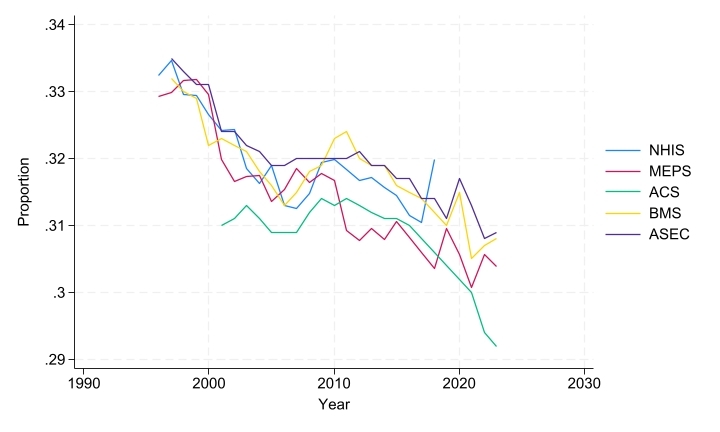
In brief, such a comparison reveals that IPUMS MEPS pointers describe a similar family demography within households to that obtained described by family pointers in other major US surveys. For instance, as shown on Figure 1, the proportion of all survey respondents who were assigned a mother in their household declined in all US-centered IPUMS data collections between the mid-1990s and the mid-2020s. This trend may well be explained by the ongoing fertility decline in the US, but nonetheless deserves further scrutiny as it could also be due to changes in patterns of living arrangements or even to changes in household rostering accuracy.
Figure 1 – Weighted Proportion of Respondents With Mother in the Household (MOMLOC!=0)
 A second way to assess the plausible accuracy of our IPUMS-constructed family pointers is to compare them to family pointers provided in the original MEPS data from AHRQ (the Agency for Healthcare Research and Quality, which field MEPS). These AHRQ-pointers are provided at the round-level and not at the annual-level. They are initially reported by the respondents themselves and are then validated or imputed by AHRQ based on internal procedures (which include tests of age plausibility in parent-child relationships). These respondent-reported pointers have benefits, but they remain subject to reporting errors from respondents and enumerators. Furthermore, it is worth noting that many other U.S. federal data sources do not provide self-reported, much less agency-validated, family interrelationship variables4. They nonetheless provide a meaningful comparison for pointers constructed strictly from algorithmic rules based on a small number of variables5.
Figure 2 – Agreement between IPUMS and Respondent-Reported Pointers by Type of Pointer
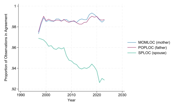 As shown above on Figure 2, there is a very high level of agreement between IPUMS and respondent-reported pointers of mothers and father (MOMLOC and POPLOC compared to MOMPIDRD and POPPIDRD), both of which show more 98% of agreement from 1997 onward. However, Figure 2 also shows a declining level of agreement between IPUMS-constructed and respondent-reported location of spouse (SPLOC and SPOUSEPNUMRD) in the household. At first glance, this decline appears to be almost monotonic throughout the whole period. Yet this overall trend hides two distinct components, as shown below on Figure 3.
Figure 3 – Discrepant Cases Between IPUMS and Respondent-Reported Pointers by Selected SPRULE Values
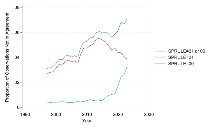
The first component of this declining rate of agreement is due to the presence of unmarried partners of household heads (RELATE code 30). These individuals cannot be designated as spouse in respondent-reported pointers, while IPUMS-constructed pointers do designate them as spouse in SPLOC. Hence this simply represents a case of IPUMS-constructed pointers relying on a broader definition of union, one that includes some cohabiting couples, to define their spousal pointer. Fortunately, this discrepancy can be directly addressed by using the variable SPRULE. Indeed, SPRULE code 21 contains all and only cases of unmarried partners to household heads coded as spouses in SPLOC. Users can therefore remove this source of discrepancy in their own extracts by simply recoding SPLOC as 0 for all observations that have SPRULE code 21. Figure 3 shows that the use of this rule has become more prevalent since MEPS was initiated, reaching a peak prevalence in the mid-2010s and declining afterward.
The second component of the declining rate of agreement in spousal pointers is more puzzling. This component has been growing in importance since the mid-2010s and cannot be addressed directly. These are a subset of individuals with SPRULE code 00; more specifically, individuals for whom the IPUMS-constructed family pointers find no spouse but who have a respondent-reported spouse located at any round of interview. For the most part, these are respondents living in one-person households reporting that they are married with a spouse present with them in the household and who provide what appears to be a valid PID for that person. This spouse is therefore only identified in the variable SPOUSEPNUMRD. In other words, our IPUMS programming rules cannot find any possible spouse for those respondents living in one-person households. It is unclear whether these discrepant cases result from incomplete household rostering on AHRQ’s part or from inaccurate respondent reports. Additional research on this issue is under way, notably to investigate whether recent trends in one-person households converge between IPUMS MEPS and other major US surveys.
In conclusion
Researchers interested in using family pointers in IPUMS MEPS should keep three caveats in mind. The first is the deterministic nature of the pointer attribution rules. Our family pointers are highly accurate but remain imperfect, and users can manage these imperfections with a great degree of flexibility using the rule variables. The second is the inclusion of some unmarried but cohabiting spouse in SPLOC, which users can directly manage using SPRULE code 21. These two caveats apply to all IPUMS data collections centered in the US. The third issue is specific to IPUMS MEPS, where we are observing a growing proportion of one-person households where respondents provide a PID for their spouse’s location in the household. We’ll keep you posted on this one.
Taken together, our family pointers are reliable, comparable, and provide new flexible opportunities for combining person-level and family-level analyses. Use these newly added variables to expand your research in both familiar and unfamiliar directions (pun very much intended)!
1 IPUMS USA applies a comparable methodology for 1970-forward samples and uses a similar but unique methodology for pre-1970.
2 This predefined logic states, for instance, that where there are multiple potential spouses in the household those individuals who are closer in age are more likely to be each other’s spouse than those individuals with a larger age gap; or that the older of two sets of dependent children in a household are more likely to have as parents the older of two sets of spouses in that same household (given a plausible age gap between parents and children). There are also rules assigning family pointers to dependent children with no clear parent in the household. For instance, IPUMS rules prioritize assigning those children to relatives over non-relatives; ever-married adults over never-married adults; older adults over younger adults; and so on. This serves as a reminder that IPUMS family pointers for parents represent social in addition to biological relationships within households.
3 Users should note that, in IPUMS MEPS, the householder is not strictly the first person listed on the household roster.
4 The Current Population Survey provides such self-reported pointers for 2007-onward.
5 We define agreement as IPUMS-constructed pointers correctly predicting parental pointers on all non-missing rounds of a given survey year, and as correctly predicting spousal pointers on any non-missing round of a given survey year. This is because we expect marital instability to be more prevalent within a calendar year than changes in living arrangements with one’s own parents.