By Sarah Flood
The team at IPUMS is excited to introduce something brand new! ATUS-CPS Linking Counts is an interactive tool for exploring the number of ATUS respondents who can be linked to specific CPS months. We know that linkages between ATUS and CPS have great potential for enabling exciting new research, but we also know firsthand how hard it can be to wrap your head around the panel component of the CPS, the relationship between ATUS and CPS, and the many possibilities for linking them. Even researchers who have deep knowledge of the ATUS and CPS may still wonder whether there is a sufficient number of cases to conduct an analysis of interest. This new tool helps address all of these challenges. It very quickly allows you to view the number of ATUS respondents who should appear in each CPS month and determine if there is sufficient sample size for a particular application of linked ATUS-CPS data.
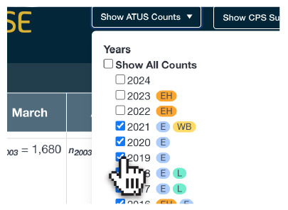
Linking ATUS and CPS data enables an incredible wealth of research questions. This tool allows users to specify and view different linking scenarios to assess the feasibility of various ATUS to CPS linkages. For example, you may want to investigate the relationship between food security in the CPS with shopping or eating-related behavior in the ATUS. This interactive tool would allow you to select only years of ATUS data that contain, for example, the Eating and Health module and view the CPS months in which the Food Security supplement was fielded to assess the sample sizes for your desired analysis. Figure 1 shows how you would select ATUS years of interest and find information about which ATUS modules were fielded in each year.
Figure 1. Selecting ATUS Years of Interest