
By Matt Gunther
IPUMS PMA has launched a new blog aimed at introducing harmonized family planning data through step-by-step analysis examples written in R. Whether you’re looking for a place to dive into Performance Monitoring for Action data or a way to learn more about free and open-source data analysis tools, the PMA Data Analysis Hub is a great place to start!
You’ll find a new post every two weeks highlighting different tips for working with PMA data. Usually, we organize these posts in a series around a theme or a particular group of variables. For example, did you know that PMA collects data from both individuals and health service providers in the same geographic area? We’ve just completed our first series of posts showing how to use service provider data as context for the family planning outcomes experienced by individuals.
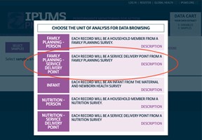
We start each series with a Data Discovery post designed to help orient you to the most relevant variables on a given topic. In our first Data Discovery post, we covered the general structure of PMA service provider data and explained how PMA uses a stratified cluster sampling technique to select providers that are most likely to impact individuals included in PMA household samples. We also review the contents from IPUMS PMA data releases to help you get working with the latest data as quickly as possible when it becomes available (check out our Data Discovery post from the latest IPUMS PMA data release).
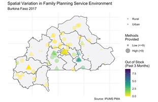
Each series will also include at least one Data Manipulation post, where we show how to use popular R functions in the particular context of working with PMA data. For example, our first Data Manipulation post demonstrated how to load a dataset and recode individual variables with the ipumsr package, and explained how to efficiently apply those functions with tools from the dplyr package. Other Data Manipulation posts covered topics like creating maps with service provider data, merging service provider data with household and female data, and merging datasets from external sources.
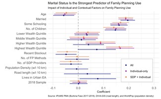
Finally, we end every series with a Data Analysis post that features analyses using the data discussed in the series. One example of a Data Analysis post shows how to build a model predicting the likelihood that a PMA female respondent is currently using family planning; this model used a range of covariates representing individual factors as well as environmental factors related to the availability and accessibility of family planning services in her area. This post includes a discussion of how to use survey weights and information about the clustered sample design. In another Data Analysis post, we discussed a recent publication from IPUMS researchers that used data about internal migration in Ethiopia to better understand unmet need for family planning services.
We hope that newcomers to PMA family planning data and R alike will find something worthwhile at the PMA Data Analysis Hub! And, for those who are already working on projects with PMA data, we welcome contributions or ideas for future posts. Please reach out to us on the IPUMS Global Health User Forum or visit our blog’s GitHub Page. We look forward to building a community of PMA researchers together!