
Geographically standardized time series tables from IPUMS NHGIS give users powerful new abilities to analyze census tables and geographic data across time.
NHGIS time series tables link together comparable statistics from multiple U.S. censuses. Geographic standardization refers to harmonizing data from separate censuses to align with a consistent set of geographic boundaries. At this time, NHGIS provides 1990, 2000, and 2010 data harmonized to 2010 census units. Subsequent releases of American Community Survey (ACS) summary data also generally use 2010 census units, making it possible to link NHGIS time series directly to ACS data for any year since 2010.
In this post, we apply this innovative NHGIS data product to explore homeownership rates in the Twin Cities (Minneapolis–Saint Paul, Minnesota), comparing rates of homeownership between black and white householders for 1990, 2000, 2010 and 2013-2017 ACS 5-Year Estimates.
The Twin Cities’ Racial Gap in Homeownership Has Grown
Since 1990, the Twin Cities metro area has maintained a higher white homeownership rate and lower black homeownership rate than the national rate for each race.
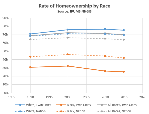
Over this time period, the white homeownership rate in the Twin Cities metro area increased by 4.4 points, compared to the national white homeownership rate increase of 1.0 point. Meanwhile, the black homeownership rate dropped by 5.4 points in the metro area but by only 1.4 points for the nation.
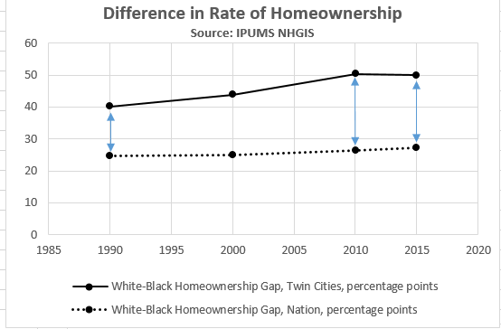
The gap in homeownership between white and black householders in the Twin Cities grew most between 2000 and 2010, coincident with the 2008 housing crisis and recession.
During this period, black homeownership rates dropped considerably while white homeownership rates experienced a moderate increase. Neither of these rates reflect national trends, which saw a slight decrease in homeownership overall.
The Context of the Twin Cities
The Twin Cities metro area has proportionally fewer black householders (7%) than the nation as a whole (12%), although the metro area is becoming more racially diverse and more representative of national trends over time. The proportion of Twin Cities households with a white householder declined by 9 percentage points since 1990, down to 85% in 2013-2017, bringing it closer to the national rate of 77%.
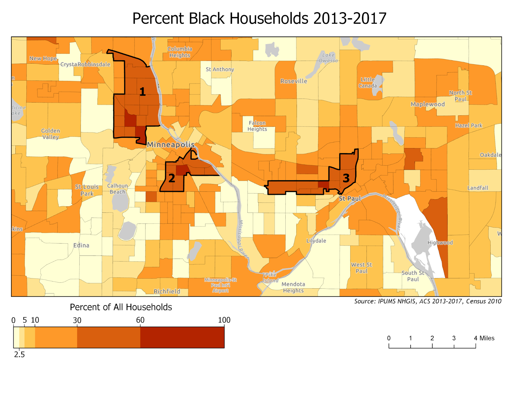
There are only three clusters of census tracts with a high (>30%) percentage of black householders. These clusters are labeled on the map above as 1 (Near North and Camden neighborhoods), 2 (Phillips, Seward, and Cedar-Riverside neighborhoods) and 3 (Frogtown, Rondo, and Summit/University neighborhoods).
Given the relatively low population of black households in some locations, not all homeownership rate changes visualized in these maps can be considered significant. For this reason, we have chosen to focus only on specific neighborhoods for some of the maps below.
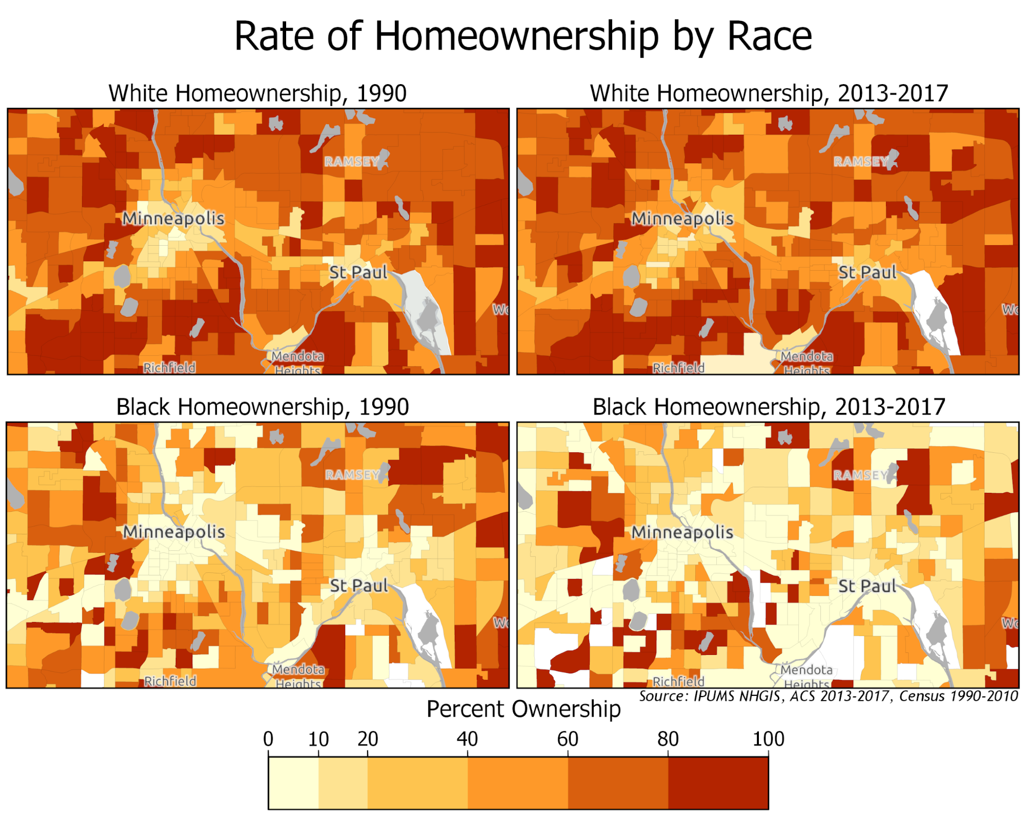
The white homeownership maps follow a clear trend of higher homeownership outside of the central neighborhoods, with very high white homeownership rates overall. Unlike white homeownership, which is clearly concentrated in suburban and exurban areas around the Twin Cities, the spatial pattern of black homeownership shows low homeownership rates both inside and outside of the city centers alongside distinct pockets of higher homeownership.
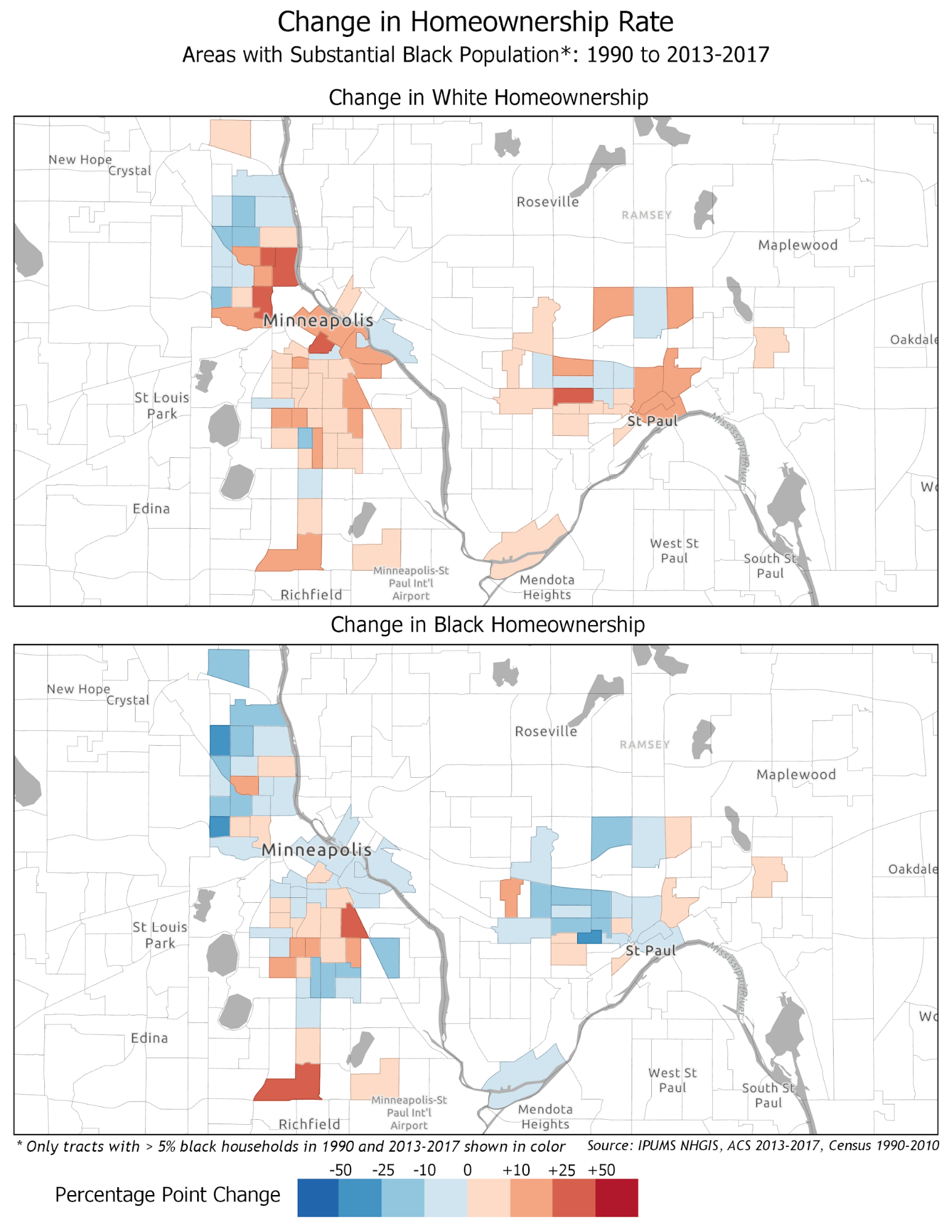
Looking specifically at areas in the Twin Cities where black households make up a substantial portion of the population allows us to more closely and accurately investigate homeownership trends. We know the gap in homeownership between the white and black population in the Twin Cities grew most between 2000 and 2010, and the effects of the housing crisis are still noticeable today, but where exactly have homeownership changes occurred? The neighborhoods we discussed earlier as home to the highest proportion of the Twin Cities black residents are sites of noticeable change.
- Near North/Camden: The white homeownership rate decreased in the north and west and increased in the south and east of the Near North and Camden neighborhoods. The most positive change was 41 points, while the most negative was about 20 points. The black homeownership rate decreased by up to 25 points in all but four census tracts. The most negative change was 28 points, while the largest positive change was 20 points.
- Phillips/Seward/Cedar-Riverside: The white homeownership rate almost universally increased in this neighborhood. Most positive changes are under 10 points, but a few tracts to the northeast increased by up to 25 points. The largest increase in this neighborhood was 35 points. The change in the black homeownership rate was variable; some areas saw considerable declines in black homeownership, and some areas saw considerable gains. Most tracts changed less than 10 points in either direction, while the largest drop was 21 points. The largest increase was almost 37 points.
- Frogtown/Rondo/Summit-University: White homeownership increased moderately in this neighborhood. Any negative changes were less than 10 points. Most positive changes were under 10 points, but tracts to the east saw a positive change of as many as 25 points. The largest increase in the neighborhood was 31 points. The black homeownership trend was almost entirely decline; the only positive changes were less than 10 points. Tracts in the center of this neighborhood lost as many as 25 points, while the largest drop was 34 points.
These neighborhoods help tell a more complete story about homeownership and race in the Twin Cities. While some areas did see rises in black homeownership, most neighborhoods, even in areas that have a higher proportion of black residents, saw a decline in black homeownership in the Twin Cities over time.
Importantly, we see many individual tracts where the white homeownership rate increased while the black homeownership rate declined, so location alone cannot explain the expansion in the racial gap in Twin Cities homeownership. That is, the disparate trends in homeownership rates were not due only to differences between the neighborhoods where black and white householders were living. Instead, the homeownership gap also grew within neighborhoods. This could have been driven by gentrification, as wealthier white homeowners replaced black homeowners, and the remaining black households reside predominantly in rental units. It may also be an indication of racially discriminatory mortgage lending practices, especially during the lead-up to the 2008 financial crisis, leading to higher rates of foreclosure and greater declines in homeownership among black households.
Further Exploration on Homeownership and Race in the Twin Cities
There are many resources available to continue exploring the relationships between homeownership and race in the Twin Cities. The effect of the late 2000s housing market and foreclosure crisis on homeownership trends cannot be understated. The history of redlining and discriminatory lending also provides important context.
Some relevant resources include:
The Center for Urban and Regional Affairs work on home foreclosure rates in MN
2017 Star Tribune article on rising homeownership disparities in the Twin Cities
Mapping Prejudice, a project on the history of racial covenants in the Twin Cities
Easily Accessible Data Through NHGIS
NHGIS time series tables provide easy access to census information with harmonized measures and geography for different time periods. For more information on how to use this unique data product, visit IPUMS NHGIS or proceed directly to the NHGIS documentation on time series tables.
Story by Cole Anderson and Alysha Alloway (Minnesota Population Center Summer Fellows)
Mentors: Jonathan Schroeder (IPUMS Research Scientist) and Steven Manson (Professor, Department of Geography, Environment & Society)