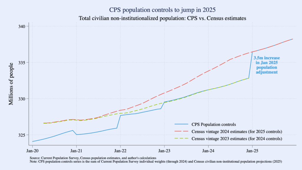
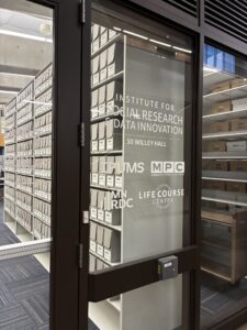
Bivariate Proportional Symbol Maps, Part 2: Design Tips with Instructions for ArcGIS Pro

By Jonathan Schroeder, IPUMS Research Scientist, NHGIS Project Manager

How to make effective bivariate proportional symbol maps

A map of the share of population under age 18 in the Miami area in 2020. There is one colored circle for each census tract. There are five colors ranging from dark blue (representing less than 15% under age 18) to light green (representing 20 to 25% under age 18) to brown (representing 30% or more). The circle sizes correspond to tract populations. Most circles have similar sizes, representing around 1,000 to 10,000 people. The circles cluster together forming groups where there are more tracts and more people. The circles in central Miami and along the coast are bluer than elsewhere.
A bivariate proportional symbol map.
Click map for larger version.

In Part 1 of this blog series, I introduced bivariate proportional symbol maps and shared some examples to demonstrate their advantages. In short, when they’re well designed, they can make it easy to see multiple dimensions of a population all at once: size, composition, and spatial distribution.

A key part of that statement is, “when they’re well designed.” Standard mapping tools can make it easy to get started, but getting all the way to a good design still takes some extra effort.

In this Part 2 post, I discuss some key design considerations for bivariate proportional symbol maps, and I provide specific instructions to help you get to a good design.

Software considerations

I used Esri’s ArcGIS Pro to create the examples here and in Part 1. The design tips I share below should be relevant for any mapping tool, but my instructions are specifically for ArcGIS Pro (version 3.2). I expect there are ways to achieve similar designs with QGIS, R, Python, etc., quite possibly more easily than with ArcGIS Pro. I can only say that it’s easier to create effective bivariate proportional symbols now with ArcGIS Pro than it was with its predecessor ArcMap.

As I proceed, I’ll flag which instructions pertain specifically to ArcGIS Pro. All other tips are “tool neutral.”

General tip: Match size to “size” and color to “character”

When selecting which features to map, a framework that works consistently well is to use symbol color to represent an intensive property—e.g., the share of population under 18 years old, average household size, median household income, or the share of votes cast for a candidate—and use symbol size to represent the number of cases to which the intensive property pertains—e.g., the total population (when color corresponds to a population share) or the count of households (when color corresponds to average household size or median household income).

This framework enables the map to illustrate both the spatial distribution of the mapped characteristics and the frequency distribution of the intensive property—e.g., not only where a candidate received large or small vote shares but also how many votes were cast in each of those areas. Other frameworks can also work well (e.g., see the change maps in Part 1), but it’s generally very helpful if the two mapped characteristics relate to each other in a way that corresponds intuitively with “size” and “color.”

Continue reading…

Bivariate Proportional Symbol Maps, Part 1: An Introduction

By Jonathan Schroeder, IPUMS Research Scientist, NHGIS Project Manager

A powerful, underused mapping technique

The world could use a lot more bivariate proportional symbol maps. These maps pair two basic visual variables—size and (usually) color—to symbolize two characteristics of mapped features. When designed well, they convey multiple key dimensions of a population all at once: size and composition as well as spatial distribution and density.

A map of the share of population under age 18 in the Miami area in 2020. There is one colored circle for each census tract. There are five colors ranging from dark blue (representing less than 15% under age 18) to light green (representing 20 to 25% under age 18) to brown (representing 30% or more). The circle sizes correspond to tract populations. Most circles have similar sizes, representing around 1,000 to 10,000 people. The circles cluster together forming groups where there are more tracts and more people. The circles in central Miami and along the coast are bluer than elsewhere.
A bivariate proportional symbol map.
Click map for larger version.

Unfortunately, standard mapping software hasn’t made it easy to create good versions of these maps, and most introductions to statistical mapping stick to simpler strategies. As a result, bivariate proportional symbols aren’t used very often. With few examples and little guidance to go on, it’s understandable that mapmakers don’t realize how often they’re a viable, well-suited option.

This two-part blog series aims to spark more interest by providing a “few examples” (Part 1) and a “little guidance” (Part 2).

Picking up where I left off

In a previous blog post, I shared an example of a bivariate proportional symbol map and described some of the technique’s advantages. But that post focuses on a mapping resource (census centers of population) rather than on mapping techniques. Most of the examples in the post are also simply “proportional symbol maps,” without the more intriguing “bivariate” part.

To close that post, I suggested “a tantalizing next step” would be to use bivariate proportional symbols with small-area data (for census tracts or block groups), and I shared a few technical notes and design tips without much detail. I later expanded on those ideas in a conference talk, sharing some new examples with small-area data and going a little deeper with design tips.

In these new posts, I’m sharing and building on the examples and tips from the conference talk.

Continue reading…

Making Your Customized IPUMS MICS Data File

By Anna Bolgrien

The newest IPUMS data collection, IPUMS MICS, has many similarities with other IPUMS microdata collections. However, there is one major difference: the IPUMS MICS Data Extract System only uses Stata.

Yes, you read that right. Users of IPUMS MICS must use Stata to open and create their customized data file.

Let’s start with how using IPUMS MICS is the same as using other IPUMS microdata collections.

If you are an IPUMS user, you will find the process of browsing the variables, looking at documentation, and adding samples to your data cart completely familiar. If you are not familiar with IPUMS, you can read more about browsing and selecting variables.

However, when you finish choosing variables and samples in IPUMS MICS and click “Create Extract,” things start to look different.

Normally, you could change the data format, but the only option currently available for IPUMS MICS is a .dat (fixed-width text) file format.

Continue reading…