Celebrating 30 Years: Three Decades of IPUMS Data

By Diana L. Magnuson; Curator and Historian, ISRDI

"Celebrating 30 years: three decades of IPUMS data" display case with promotional materials, swag items, and historical IPUMS items
“Celebrating 30 years: three decades of IPUMS data” display case at ISRDI Headquarters

“Celebrating 30 Years: Three Decades of IPUMS Data,” the current exhibit at ISRDI Headquarters, highlights thirty years of data innovation at the University of Minnesota. In the late 1980s, the Social History Research Laboratory at the University of Minnesota’s History Department proposed “the creation of a single integrated microdata series composed of public use samples for every year … with the exception of the 1890 census, which was destroyed by fire.” The primary aim was to make the U.S. census microdata “as compatible over time as possible while losing little, if any, of the detail in the original datasets.” (Integrated Public Use Microdata Series: A Prospectus).

Steven Ruggles remembers the moment he went into the History Department lounge on the sixth floor of the Social Science Tower and said, “IPUMS! Integrated Public Use Microdata Series! Isn’t that a great idea?” The response from the graduate research assistants was not enthusiastic. “What a terrible name! You can’t call it that!” According to Ruggles, “It was universal; everyone thought it was just a horrible name … It wasn’t a bad idea to propose, just a terrible thing to call it.” After a brief quandary over pronunciation (Ī-pŭms or Ĭ-pŭms), the name has stuck and is now synonymous with social research, data innovation, and free access. And for the record, we don’t care how you pronounce it, just as long as you cite it!

Continue reading…

New IPUMS DHS Climate Change and Health Research Hub

By Miriam King, Senior Research Scientist

Men wading through flood waters
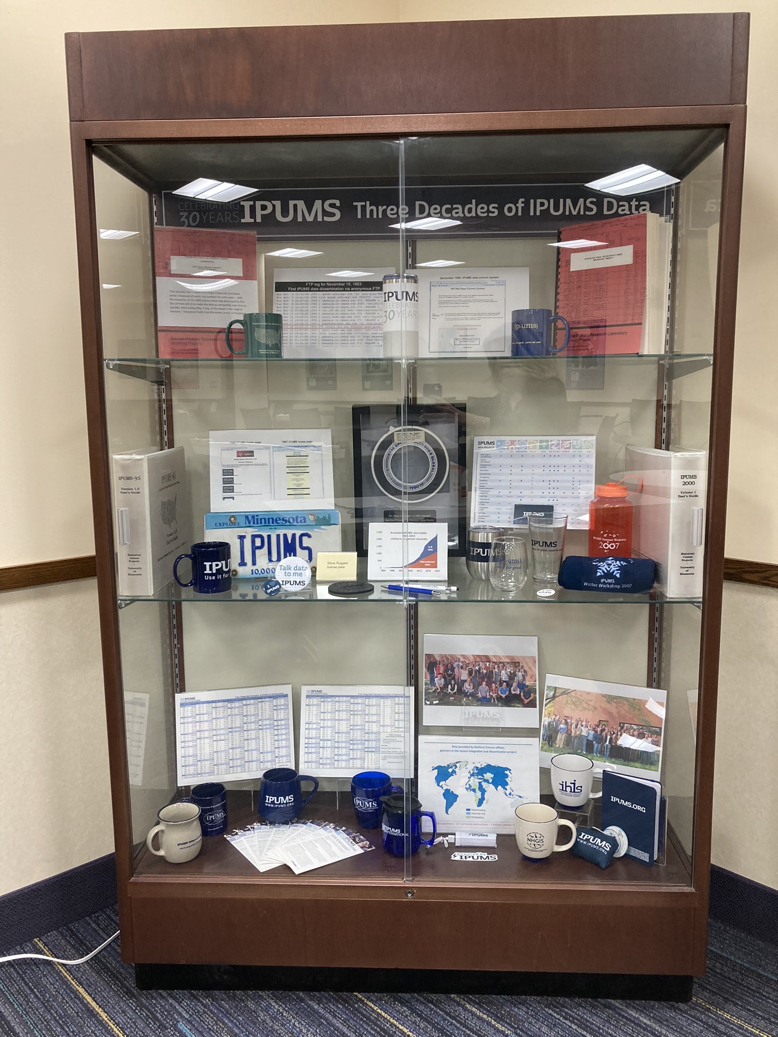
In October 2023, the World Health Organization stated, “3.6 billion people already live in areas highly susceptible to climate change. Between 2030 and 2050, climate change is expected to cause approximately 250,000 additional deaths per year, from undernutrition, malaria, diarrhea and heat stress alone.”

The Demographic and Health Surveys (DHS) are an ideal source for research on the health effects of climate change. Since the 1980s, the DHS has collected a broad range of nationally representative health data from over 90 countries. With supplemental funding from NICHD, harmonized DHS data from IPUMS (dhs.ipums.org) is now doing more to support research on the effects of climate change on health. We are adding new contextual variables; we are integrating data from Malaria Indicator Surveys (MIS); and we are offering guidance through the new Climate Change and Health Research Hub.

Sound research on climate change and health requires combining social science and health data with natural science data. While social scientists and public health researchers have considerable experience analyzing health survey data, few have been trained in simultaneously employing data on environmental factors. This knowledge gap is addressed by the Climate Change and Health Research Hub, under the leadership of Dr. Kathryn Grace and Senior Data Analyst Finn Roberts.

Continue reading…

Bivariate Proportional Symbol Maps, Part 1: An Introduction

By Jonathan Schroeder, IPUMS Research Scientist, NHGIS Project Manager

A powerful, underused mapping technique

The world could use a lot more bivariate proportional symbol maps. These maps pair two basic visual variables—size and (usually) color—to symbolize two characteristics of mapped features. When designed well, they convey multiple key dimensions of a population all at once: size and composition as well as spatial distribution and density.

A map of the share of population under age 18 in the Miami area in 2020. There is one colored circle for each census tract. There are five colors ranging from dark blue (representing less than 15% under age 18) to light green (representing 20 to 25% under age 18) to brown (representing 30% or more). The circle sizes correspond to tract populations. Most circles have similar sizes, representing around 1,000 to 10,000 people. The circles cluster together forming groups where there are more tracts and more people. The circles in central Miami and along the coast are bluer than elsewhere.
A bivariate proportional symbol map.
Click map for larger version.

Unfortunately, standard mapping software hasn’t made it easy to create good versions of these maps, and most introductions to statistical mapping stick to simpler strategies. As a result, bivariate proportional symbols aren’t used very often. With few examples and little guidance to go on, it’s understandable that mapmakers don’t realize how often they’re a viable, well-suited option.

This two-part blog series aims to spark more interest by providing a “few examples” (Part 1) and a “little guidance” (Part 2).

Picking up where I left off

In a previous blog post, I shared an example of a bivariate proportional symbol map and described some of the technique’s advantages. But that post focuses on a mapping resource (census centers of population) rather than on mapping techniques. Most of the examples in the post are also simply “proportional symbol maps,” without the more intriguing “bivariate” part.

To close that post, I suggested “a tantalizing next step” would be to use bivariate proportional symbols with small-area data (for census tracts or block groups), and I shared a few technical notes and design tips without much detail. I later expanded on those ideas in a conference talk, sharing some new examples with small-area data and going a little deeper with design tips.

In these new posts, I’m sharing and building on the examples and tips from the conference talk.

Continue reading…