Jonathan Schroeder, IPUMS Research Scientist, NHGIS Project Manager
The best mapping resource no one’s using?
In the domain of U.S. population mapping, the Census Bureau’s centers of population may be the nation’s most underused data resource. Before I explain why, let’s cover some basics…
What are they? A center of population represents the mean location of residence for an area’s population, roughly the average latitude and longitude, adjusting for the curvature of the earth. For the last three decennial censuses (2000, 2010, 2020), the Census Bureau has published centers of population separately for U.S. states, counties, census tracts, and block groups.
Where can you get them? Through the Census Bureau website, you can download files containing the latitude and longitude coordinates for centers of population. To facilitate mapping and analysis, IPUMS NHGIS has transformed the coordinates into point shapefiles, available for download through the NHGIS Data Finder.
What are they used for? At the moment, not much! But there are dozens of settings where they’d be helpful. I’m hoping this blog will help get the word out, and if it does, you might now be reading this in some future age, marveling how we ever went so long without using them!
OK, how should we use them? In the case of statistical maps—my focus here—centers of population are wonderfully effective for placing proportional symbols. I share lots of examples down below to demonstrate, but first, let’s consider the general advantages of proportional symbol maps compared to a more common alternative: choropleth maps…
Three cheers for proportional symbols
There are several standard ways to map summary data for geographic areas, including proportional symbol maps, but in the digital era, the prevalent approach has been choropleth mapping: varying the fill symbols of areas to correspond with statistical characteristics.
Where are the children? A choropleth map
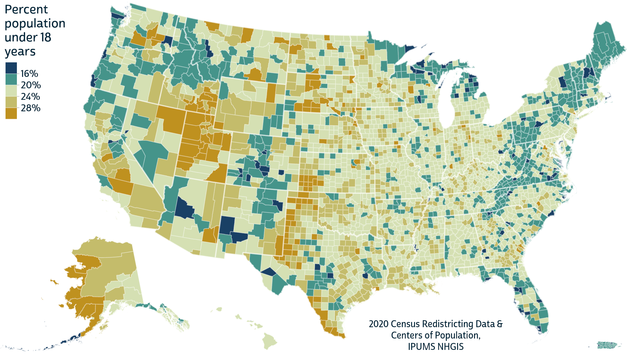
Choropleth maps are intuitive, familiar, and about as easy to produce as any other map type: all good reasons for their popularity. But they have some big disadvantages, and there are some good alternatives, such as proportional symbol maps, which place a point symbol in each area and vary the symbol sizes.
Where are the children? A bivariate proportional symbol map

This map takes proportional symbols a step further, varying both their sizes and colors to produce bivariate proportional symbols. This approach has some disadvantages compared to the choropleth map. It can be hard to discern the colors for many small-population counties, especially if you’re viewing this on a small screen. It can also be hard to distinguish the overlapping circles in regions where neighboring counties have large populations.
But there are some big advantages that, in my view, greatly outweigh the liabilities. Start with this question: which major cities have the lowest shares of children? I’d want a map like these to provide a clear answer, but the choropleth map—the standard way of doing these things—fails badly. The counties containing Manhattan, Boston, and San Francisco all have shares in the lowest class, but because these counties are small (as they are for several major U.S. cities), it’s nearly impossible to show their colors clearly on a choropleth map at a typical national map scale. On a proportional symbol map, these counties pop right out, with a prominence suitably proportional to their populations.
The choropleth map’s coast-to-coast fill symbols may make for a more colorful, eye-popping map, but much of that “fill” is misleading, giving emphasis to huge swaths of sparsely populated land. Because the sparser counties often share characteristics that differ from denser counties’, choropleth maps can give badly false impressions of the balance of classes for the whole population. (Think of the maps of a close election that are dominated by one party’s color.)
In contrast, bivariate proportional symbol maps show the spatial distribution and the distribution by population simultaneously. Proportional symbols also avoid another problem caused by choropleth fill symbols: the impression that characteristics are spread out evenly within each county and change abruptly at their boundaries, which is rarely accurate.
Location, location, location
Proportional symbols may be underused, but they’re not uncommon. Their advantages are well known among savvy cartographers and designers, and they’re covered in many map design texts and courses. But when proportional symbols are used to map statistics for geographic areas, there’s an important design question that I haven’t seen covered elsewhere: where should each symbol be placed?
The standard placement puts each symbol in the “middle” of its area. By default, ArcGIS Pro, which I used to make the maps here, places each area’s symbol at its geometric centroid, as on the left in the figure below. (In irregular cases where the centroid is outside an area or near its boundary, ArcGIS Pro moves the symbol to be inside a larger section of the polygon.) This is a sensible approach if the only spatial information you have is polygon data or centroids, which is often the case, but not always!
Two ways to place proportional symbols
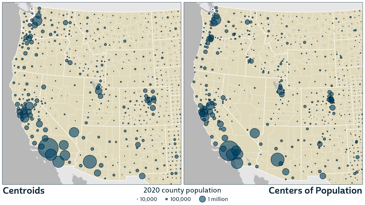
The areas for which centers of population are available—states, counties, census tracts, and block groups—are all among the most common areas used in U.S. statistical maps. When mapping any of these areas, we needn’t rely on centroids to place proportional symbols. Using centers of population instead can make mapped distributions much more similar to actual on-the-ground distributions, potentially revealing important features that are otherwise hidden or misrepresented.
This is especially clear when mapping the counties of the western U.S. as above. These counties are generally larger than those in the east, and their populations are often heavily concentrated in a small area. If the populated part of a county is far from its centroid, a centroid-based map gives a false impression that the population is centered in a remote location. This can be just as misleading as the impression from a choropleth map that characteristics are uniformly distributed in each area.
One disadvantage of using centers of population is that they can cause more overlap among symbols in densely settled regions, but this clustering of symbols also corresponds meaningfully to clusters of population. Intuitively, if you’d like to map the population distribution accurately, it makes sense to place symbols that represent people where the people actually are.
Let’s take a tour!
Pacific Northwest
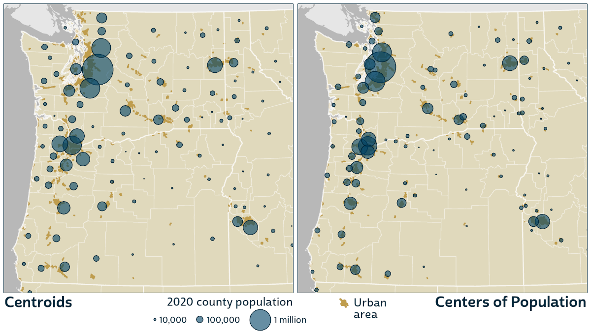
Much of the population of the Pacific Northwest resides in a corridor following Interstate 5 along the Puget Sound in Washington and down through Oregon’s Willamette Valley. While a centroid-based map disperses the corridor’s population into the surrounding mountains, the centers of population accurately accentuate the corridor’s narrowness. To the east, many centers of population cluster along the Columbia and Snake Rivers, properly vacating the high desert, as around the southern end of the Oregon-Idaho border.
California & Nevada
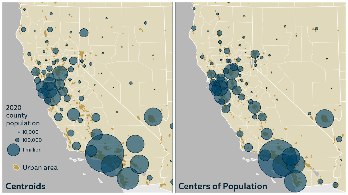
The centers of population again leave the deserts appropriately empty here. Reno’s population returns home from remote northwestern Nevada. In south central Nevada, the population of massive Nye County moves down into the orbit of Las Vegas. In southern California, the populations of San Bernardino and Riverside Counties take their proper place close to Los Angeles. In California’s Central Valley, the centers align to reveal a distinct corridor following Highway 99.
Central West

In the upper left, in eastern Idaho, the centers of population coalesce along the Snake River. In Utah, they come together along the general path of Interstate 15. In Colorado, the largest populations align neatly along the base of the Front Range. In the upper right, in western South Dakota, the centers of population follow Interstate 90’s path around the Black Hills.
Upper Midwest
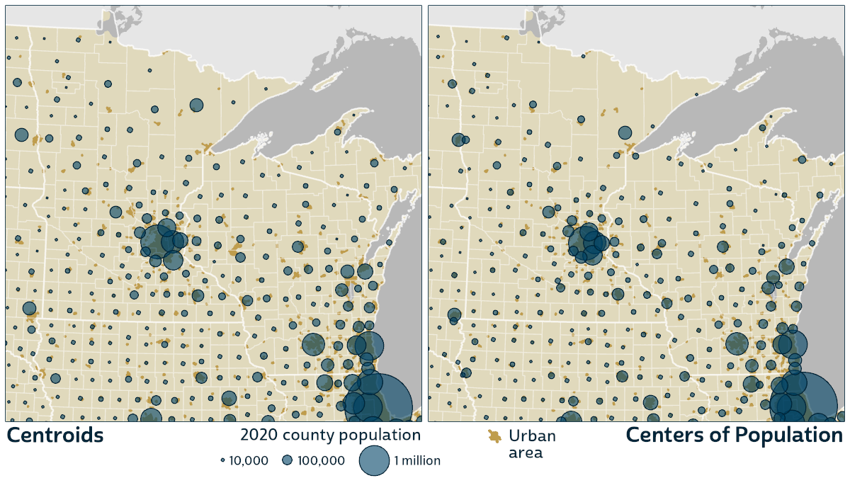
In eastern states there are fewer big shifts between county centroids and centers of population, partly because the counties are smaller and partly because populations are more evenly distributed within counties. You can still spot some large differences in the sparser areas, like northern Minnesota, Wisconsin, and Michigan. Notice the circles that converge around Duluth at Lake Superior’s western tip.
Northeast
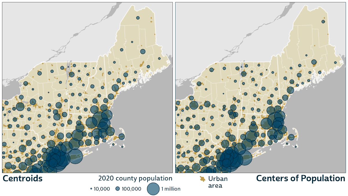
The biggest shifts in the Northeast appear in Maine, where the centers of population helpfully show the sharp difference in density between the north and south. In New York, the centers spread away from the rugged Adirondacks and align along the route of the Erie Canal.
Florida

In Florida, the centers of population properly hug the coastline all around. At the southern tip, Monroe County’s circle moves from the unpopulated Everglades National Park out to the densely settled Keys.
Alaska
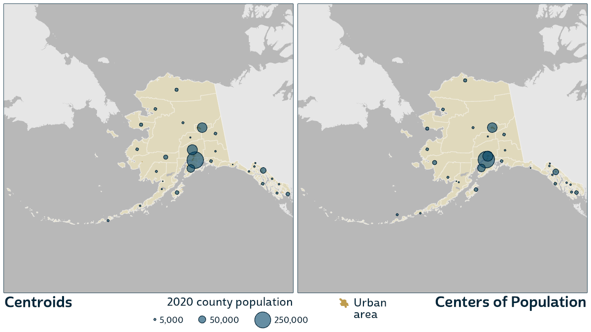
In Alaska as in Florida, many of the population centers are near the coasts. The center of population for the Bethel Census Area, a county equivalent in southwest Alaska, is over 200 miles west of ArcGIS Pro’s symbol placement.
Zooming In
I’ve showcased county maps here because counties are, I’d guess, the most common area unit in U.S. statistical maps, and centers of population noticeably improve county maps in many places that should be familiar to readers. But before closing, I’d like to provide at least a glimpse of the potential value of centers of population for areas smaller than counties.
The populations of census tracts and block groups, two standard small-area census units, have internal spatial distributions that can be just as idiosyncratic as those in counties. Especially in western states, where mountains and aridity restrict the range of human settlement much more than in the east, the population centers of large tracts and block groups are often far from their centroids.
This is evident among the tracts of the San Francisco Bay Area (below left). You can see that the centers of many of the large tracts are located at the tracts’ outer edges, often close to neighboring centers, contributing to the density of settlement in a way that would be lost on choropleth maps and centroid-based proportional symbol maps.
San Francisco Bay Area
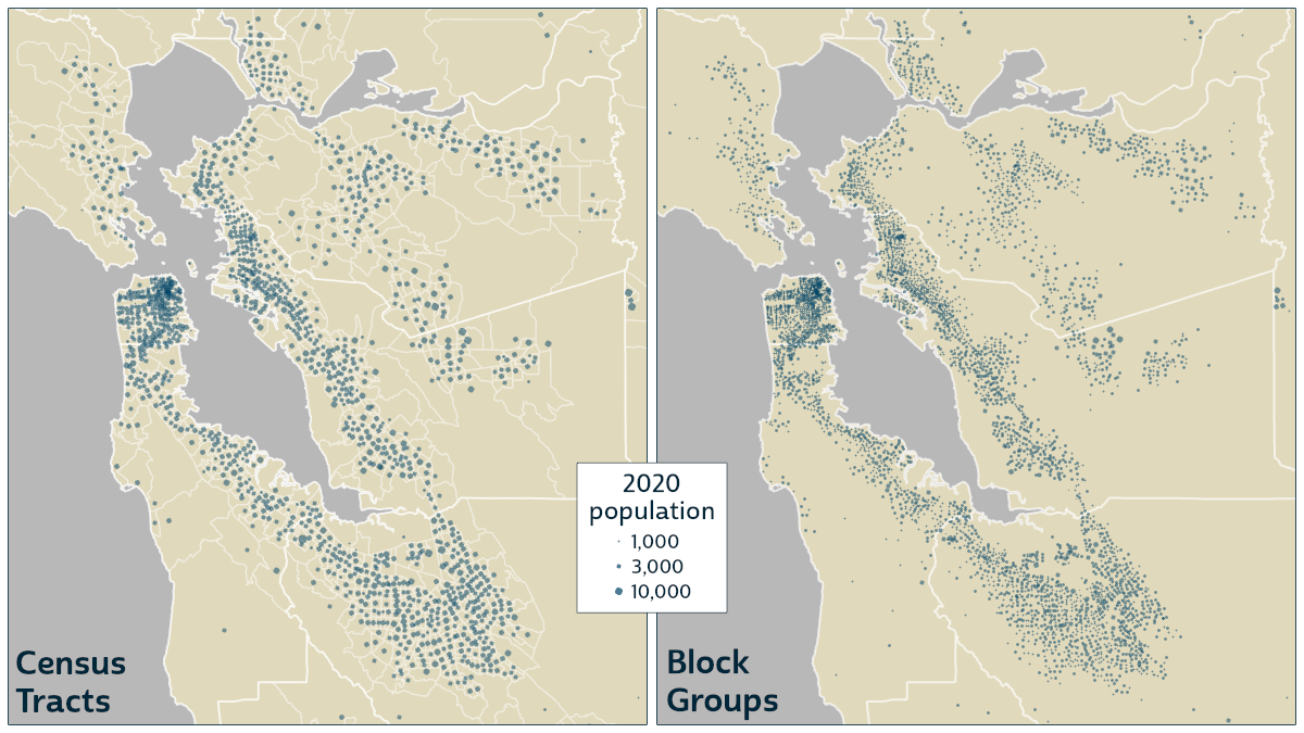
I chose not to map the boundaries of block groups because in the denser areas, they merge together into indistinct blobs of white. But the remaining circles are still entirely functional on their own. Because the populations of block groups are deliberately designed to have a narrow range—never very large, rarely very small—their proportional circles are similarly sized. The effect of mapping them without boundaries, at the centers of population, achieves most of the benefits of dot density maps without any concerns about how to place the dots. The centers of population are already optimally located!
A tantalizing next step would be to color the circles based on tract or block-group population characteristics to reveal neighborhood-level variations. I’m confident this would compare well, again, to choropleth maps, so I’m excited to see maps that take this approach. But for now, I’ll leave that to future work—either mine or yours!
UPDATE: Some of this “future work” is now “past work”! In an October 2022 conference talk on mapping with centers of population, I shared some maps using bivariate proportional symbols for tracts and block groups. I later shared and added to those maps in a February 2024 blog post that gives a more complete introduction to bivariate proportional symbol maps. Another follow-up post provides some detailed design tips for such maps with instructions for ArcGIS Pro.
Technical Notes
To produce the maps with centers of population here, I used NHGIS polygon shapefiles to illustrate boundaries, and I overlaid NHGIS center-of-population shapefiles with symbol sizes proportional to populations. Conveniently, the center-of-population shapefiles already include total population counts, but if you wish to map other characteristics, you can download tables from NHGIS and join them to the centers of population based on the common “GISJOIN” identifier that appears in most NHGIS data files.
I recommend using a semi-transparent fill for proportional symbols, which makes it easier to identify overlapping symbols. For a bivariate proportional symbol map, I recommend varying the colors of symbol outlines as well as their fills. That makes it possible to discern the class color of even the smallest circles, for which the fills are too small to see but the outlines are still visible.