
By Jonathan Schroeder, IPUMS Research Scientist, NHGIS Project Manager
A powerful, underused mapping technique
The world could use a lot more bivariate proportional symbol maps. These maps pair two basic visual variables—size and (usually) color—to symbolize two characteristics of mapped features. When designed well, they convey multiple key dimensions of a population all at once: size and composition as well as spatial distribution and density.
Click map for larger version.
Unfortunately, standard mapping software hasn’t made it easy to create good versions of these maps, and most introductions to statistical mapping stick to simpler strategies. As a result, bivariate proportional symbols aren’t used very often. With few examples and little guidance to go on, it’s understandable that mapmakers don’t realize how often they’re a viable, well-suited option.
This two-part blog series aims to spark more interest by providing a “few examples” (Part 1) and a “little guidance” (Part 2).
Picking up where I left off
In a previous blog post, I shared an example of a bivariate proportional symbol map and described some of the technique’s advantages. But that post focuses on a mapping resource (census centers of population) rather than on mapping techniques. Most of the examples in the post are also simply “proportional symbol maps,” without the more intriguing “bivariate” part.
To close that post, I suggested “a tantalizing next step” would be to use bivariate proportional symbols with small-area data (for census tracts or block groups), and I shared a few technical notes and design tips without much detail. I later expanded on those ideas in a conference talk, sharing some new examples with small-area data and going a little deeper with design tips.
In these new posts, I’m sharing and building on the examples and tips from the conference talk.
Example 1: Colored areas vs. colored proportional symbols
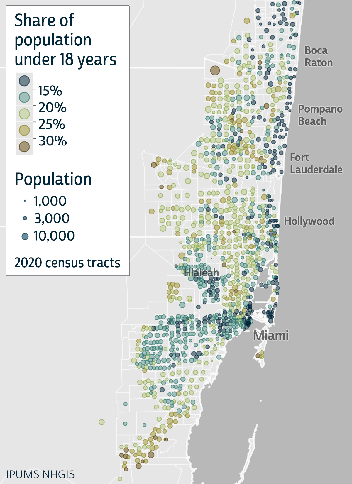
The two maps below show the 2020 share of population under 18 years of age by census tract in the San Francisco Bay area. The first map uses the common “choropleth” technique: varying the fill colors of areas to correspond with quantitative characteristics. The second map uses bivariate proportional symbols, which vary by color as the choropleth symbols do but also vary by size in proportion to a second characteristic, in this case tract populations.
Filling whole areas with color naturally emphasizes the characteristics of larger areas, regardless of their relative importance, while the symbols for very small areas can be too small to discern. Filling each area with a single color also suggests uniform characteristics within each area and abrupt changes at area boundaries, which is often misleading.
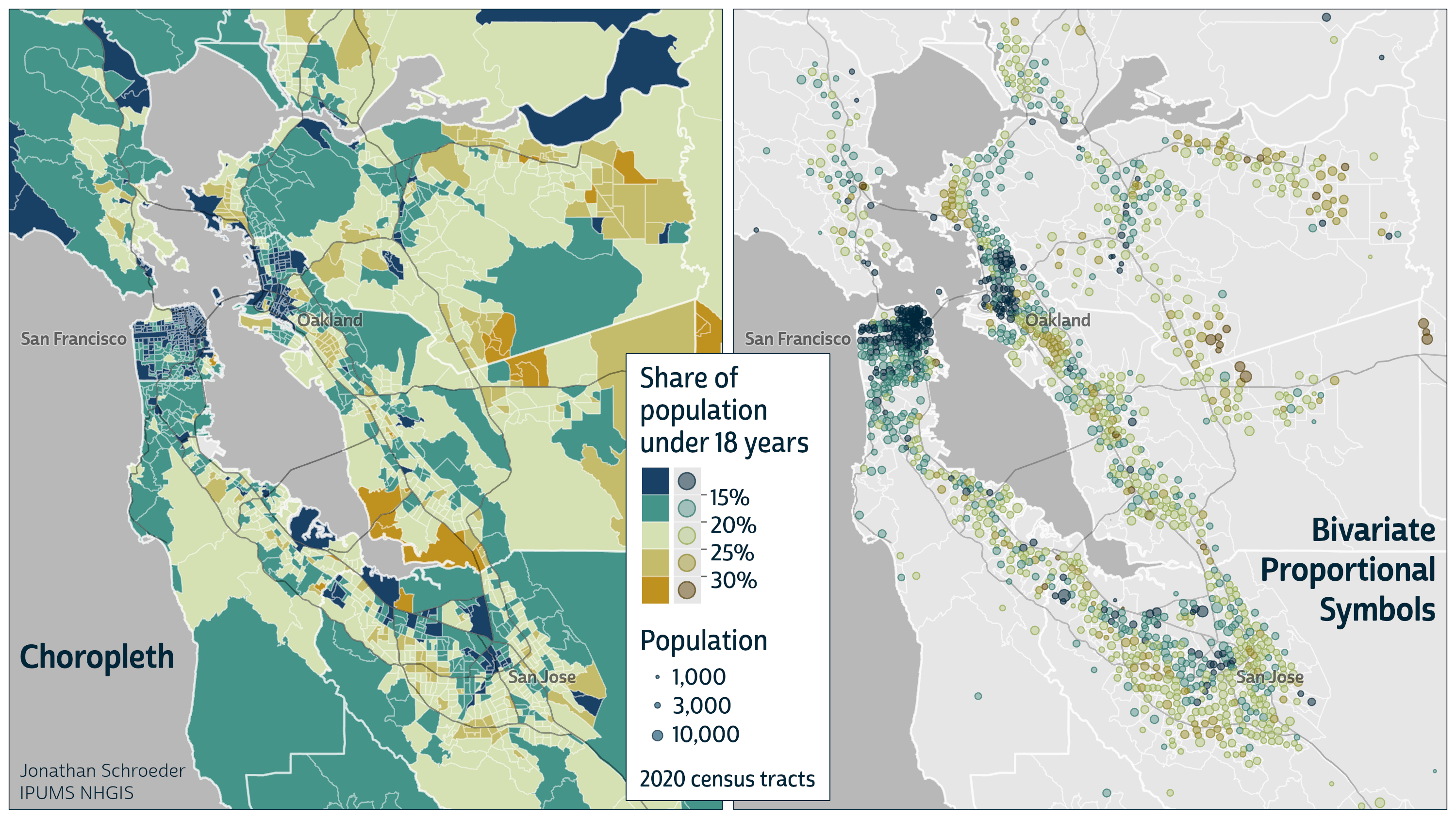
The map on the right illustrates how bivariate proportional symbols avoid all of these issues. Their colors convey all the same information that the choropleth map does, but because the symbol sizes are proportional to tract populations, the balance of colors is more meaningful, accurately portraying the relative prevalence of each statistical class in terms of the population in that class (rather than the area covered by the class). Because I placed these symbols at the tract centers of population, their arrangement also corresponds well to the actual population distribution.
I’ve copied the same maps below and highlighted two tracts that illustrate these dynamics especially well. The choropleth colors for the two tracts (in dashed red ovals) each fill up more map space than the entire city of San Francisco even though their populations are a hundred times smaller. Because their colors differ sharply from most of their neighbors’, their intricate shapes stand out even though they have no particular significance; these boundaries mostly run through sparsely populated areas with little to no bearing on any tract’s age composition.

The proportional symbols for these two tracts (marked by red arrows) are appropriately much less prominent, allowing the denser and more populous parts of the metro area to stand out instead. Being placed at the tract centers of population, these symbols also better represent where the tracts’ age composition is determined and how their populations are situated relative to their neighbors’.
Overall, the patterns on the choropleth map look more random and jagged, with substantial areas of high and low rates of children scattered throughout the region and with many abrupt changes. In contrast, on the right, it’s readily apparent that the central cities of San Francisco and Oakland have distinctly high concentrations of low-share neighborhoods. It’s clearer that other areas with low shares of children involve smaller populations with less significance for the region’s general patterns. It’s also possible to distinguish where there are substantial populations—and not just large areas—with high shares of children. Both maps show the same outliers and sharp differences in shares of children, but the prominence of these features is appropriately reduced on the right and kept in proportion to the populations involved.
Example 2: Finer detail, across time
We’ve now looked at an example at the census tract level, adding to the county-level example from my previous post. This next example is for even smaller areas—block groups—and it adds a time dimension, pairing a 1990 map with a 2020 map.
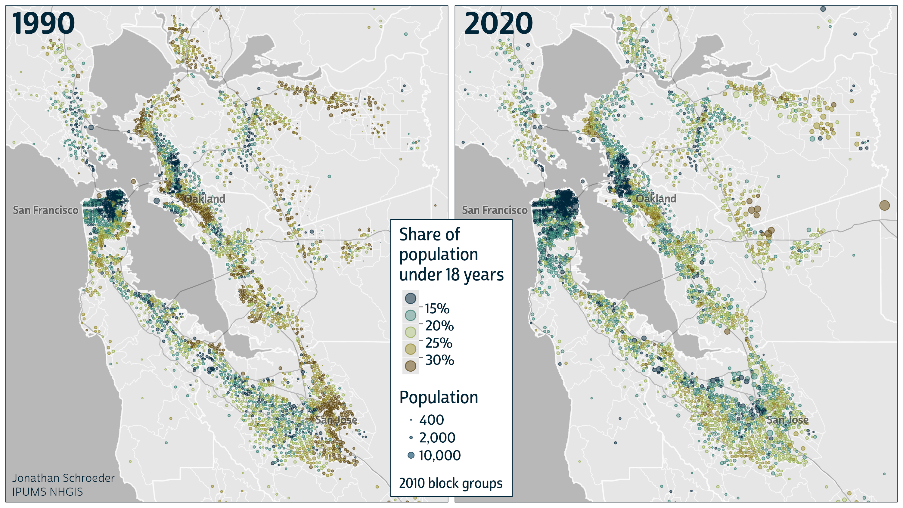
Note: These maps use geographically standardized NHGIS time series tables, which currently provide data from 1990 through 2020 for ten levels of 2010 census geography, including block groups.
See any interesting stories here? I do! Almost immediately, I see that many neighborhoods had lower shares of children in 2020 than in 1990. It’s also easy to identify a few prominent spatial patterns in each year and a few areas of substantial population growth (where the circles are distinctly larger in 2020). And because the colors on these maps are balanced in proportion to population sizes—not areas—we can easily assess how significant these patterns and trends are for the entire Bay Area population.
I don’t have a strong recommendation about using block groups or tracts for maps like this. I’ve shared examples of both to demonstrate that they both work well. The most notable consideration is that tracts are almost 3 times larger than block groups on average, so there’s more room to use larger symbols for tracts, making their colors easier to distinguish. On the other hand, mapping block group data can reveal fine-grained variations and anomalies not visible at the tract level without diminishing the clarity of the broader patterns.
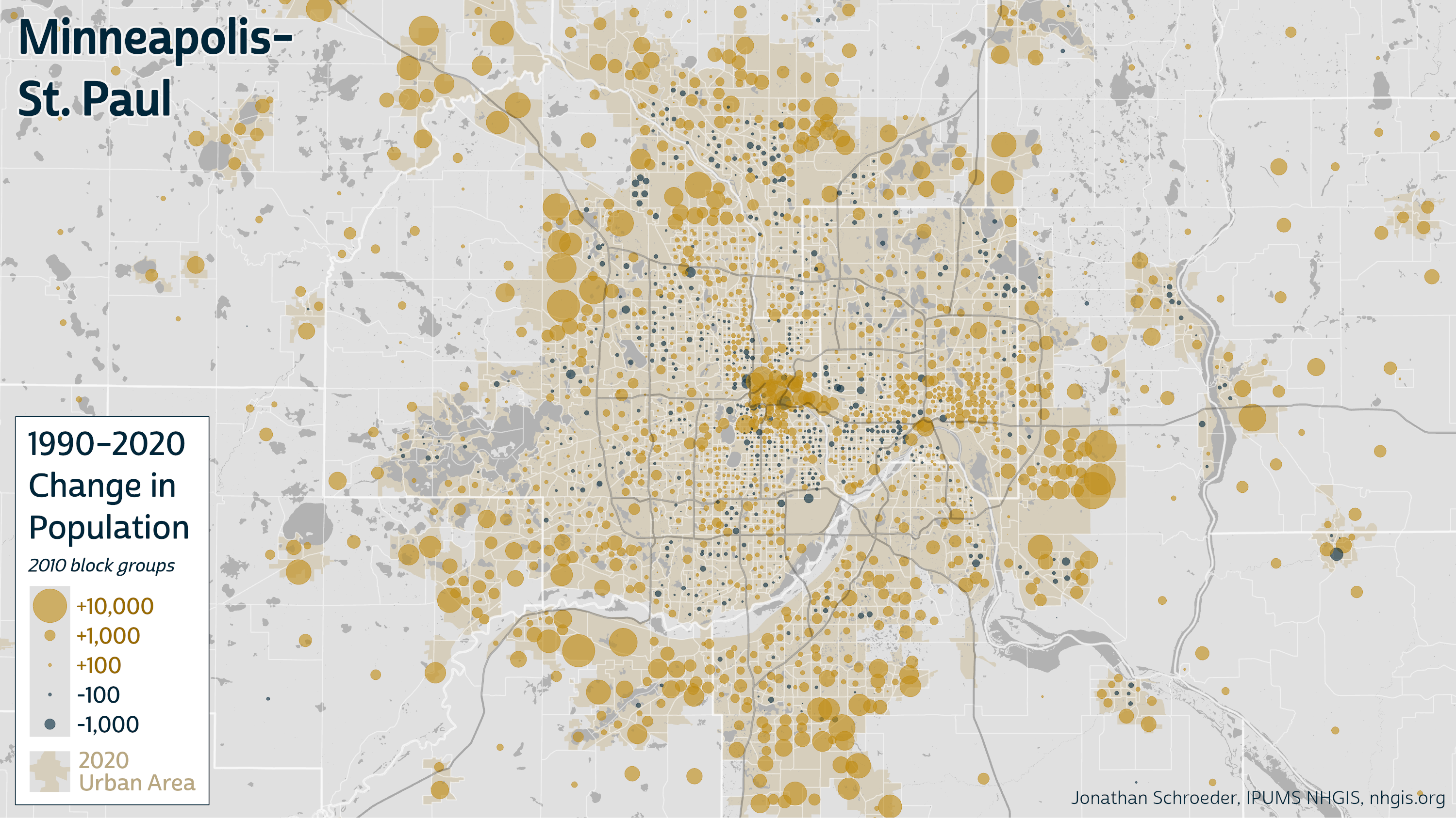
Example 3: A variation for mapping growth and decline
To wrap up, I’ll share a few examples of another setting where bivariate proportional symbols can be useful: change maps. In this case, the symbol sizes are associated with absolute change in total population, and the color only distinguishes the direction of change: growth vs. decline.
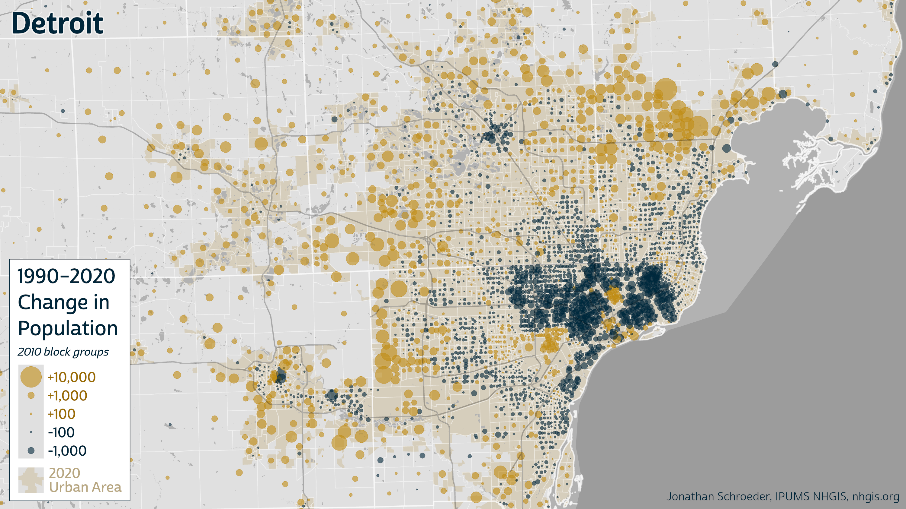
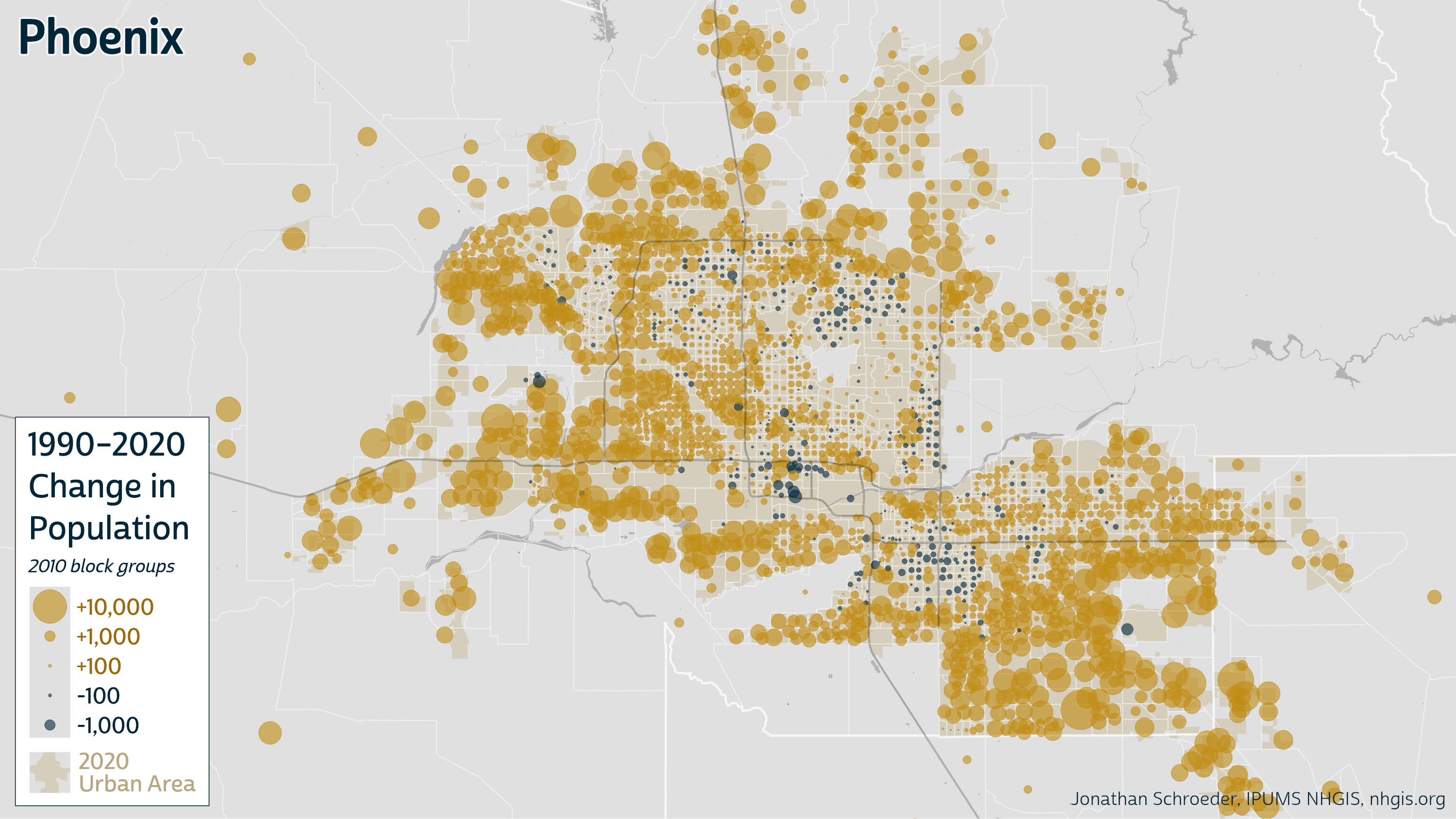
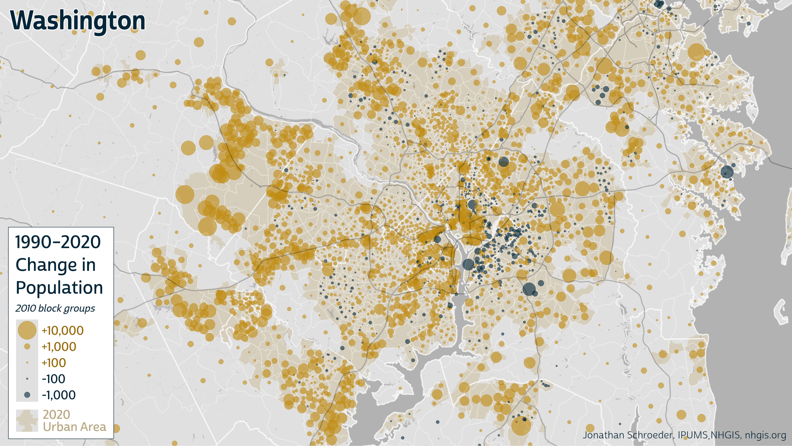
Click any map for larger version
Note: As in Example 2, these maps use data from geographically standardized NHGIS time series tables.
I won’t go into all the interesting patterns these maps reveal nor discuss all the advantages of this approach over choropleth change maps. The key point, in short, is that these maps reveal some important features that are not as clear with other mapping approaches. In a glance, we can see both where population grew or declined and by how much, with symbols conveying both the locations and magnitudes of change more exactly than a choropleth map would. Because the symbols use the same size scale across all the maps, we can also get a good sense of the overall magnitude of growth and decline for each whole metro area relative to the others.
If these examples have gotten you more interested in making maps like this yourself, then you can check out the second part of this blog series where I provide some general design tips along with specific instructions for ArcGIS Pro.