By Kari Williams & Sarah Flood
The signature activity of IPUMS is data harmonization, or making variables interoperable across time, to facilitate pooling of multiple months or years of data, as well as comparative and trend analyses. It’s easy to get carried away in the magic of not needing to perform routine data cleaning and having documentation organized at the variable level, and perhaps miss some bigger picture considerations. The Current Population Survey (CPS) annual population controls adjustment is an excellent example.
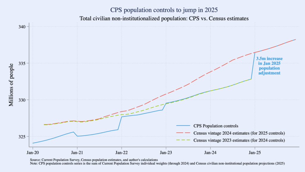
Each January, the Census Bureau revises the CPS weights to incorporate new population controls, based on the Census Bureau’s updated population estimates. However, the Census Bureau doesn’t re-release previous weights for the CPS based on the new population controls. If you look at trendlines of weighted count estimates using CPS monthly data, you might notice a discontinuity between each December and January – these are the annual population control adjustments at work. In January 2025, the shift is particularly abrupt; this is because the 2024 vintage population estimates (i.e., the population controls for the 2025 CPS) reflect an improvement in the Census Bureau’s methodology for measuring net international migration.

Figure from Jed Kolko’s Population adjustments will cause the next jobs report to be misinterpreted and misconstrued.


